
A showcase of strategic logo design, color palettes, and complete brand systems that bring a company’s personality to life. From concept to execution, these projects highlight my ability to create cohesive, recognizable, and timeless brand visuals.
Small Business Branding: Trust N' Us Maintenance
Trust N' Us Maintenance is a family-owned handyman and property maintenance business dedicated to providing dependable, high-quality repair and upkeep services for homes and small businesses. Whether it's routine fixes, home improvements, or emergency repairs, the brand stands on the values of trust, reliability, and honest work — just like the name says.
For this project, I created a bold, approachable brand identity that captures the hardworking spirit of the business. The visual system includes a strong, modern logo with clean lines and a versatile submark. A classic, trustworthy color palette was chosen to reflect professionalism and confidence, while still being welcoming and easy to recognize on uniforms, business cards, and vehicles.
This identity package was developed as part of a real client collaboration to help Trust N' Us Maintenance present itself clearly and confidently in a competitive local market.


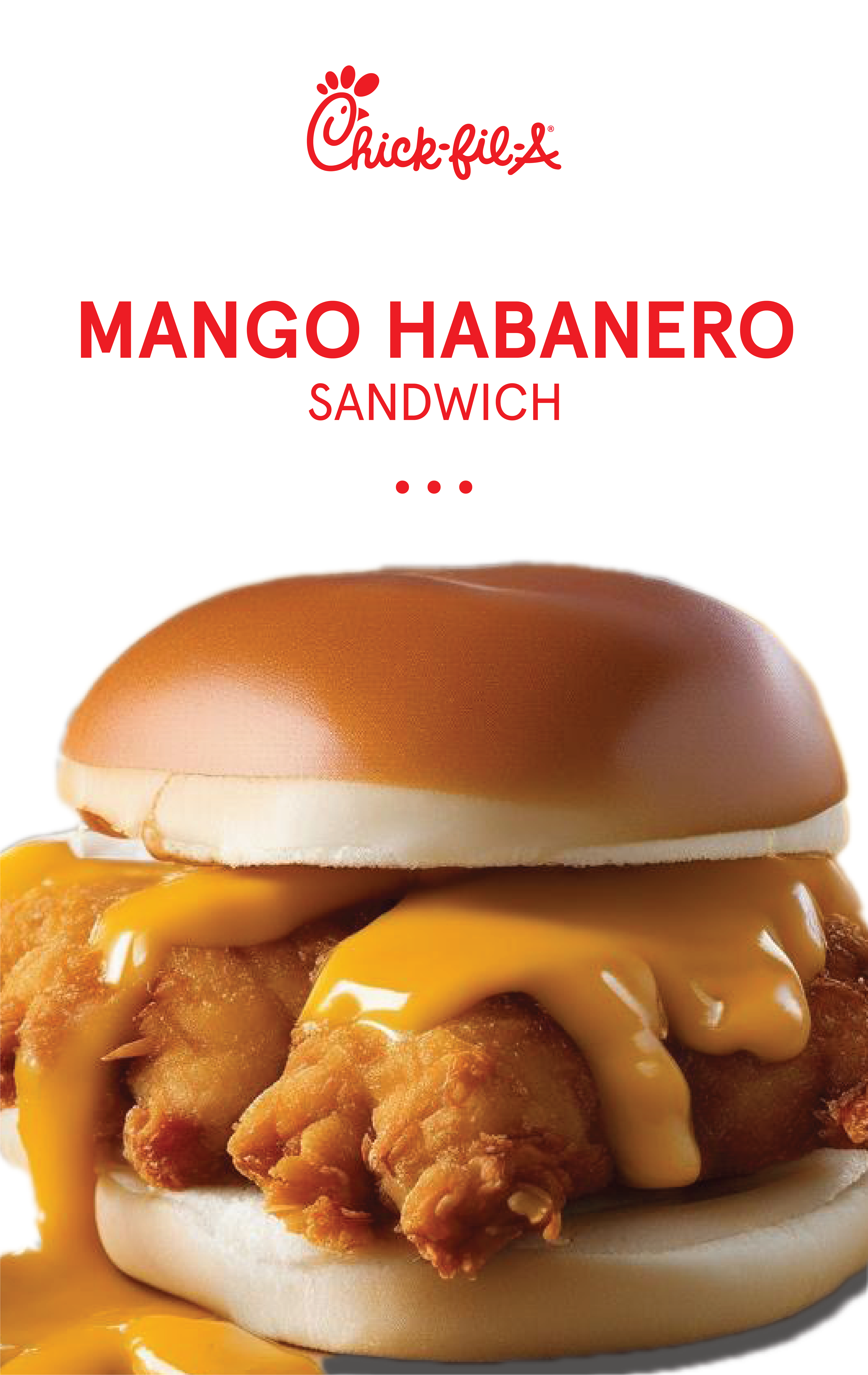
Spec Concept: Chick-fil-A Spicy Mango Habanero Launch
This speculative branding project was created to showcase my skills in conceptualization, problem-solving, and execution as both an Art Director and Graphic Designer. The challenge was to develop a new menu item for Chick-fil-A that appeals to customers seeking a sweet and spicy flavor profile.
Chick-fil-A is known for its classic chicken sandwiches and family-friendly atmosphere. However, the brand was missing a spicy, sweet option to cater to customers who crave bolder flavors. My goal was to introduce a new recipe that aligns with the brand's identity while expanding its appeal to adventurous eaters.
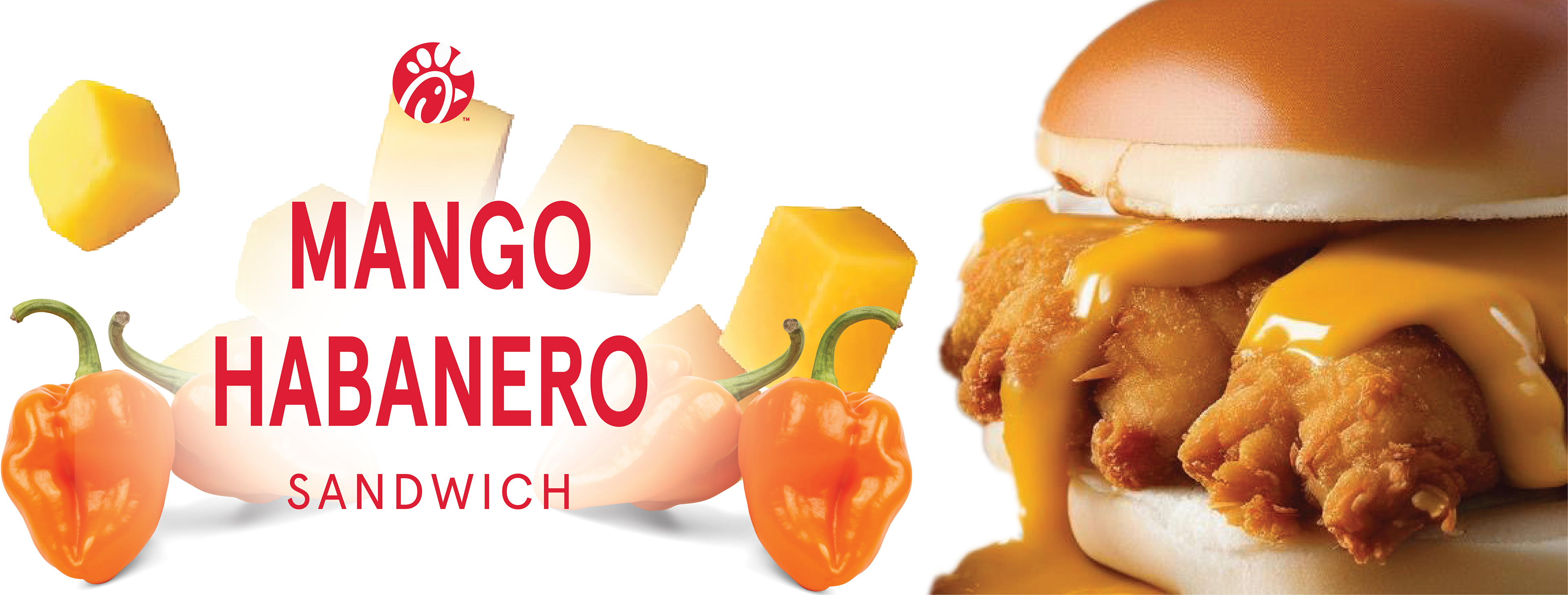
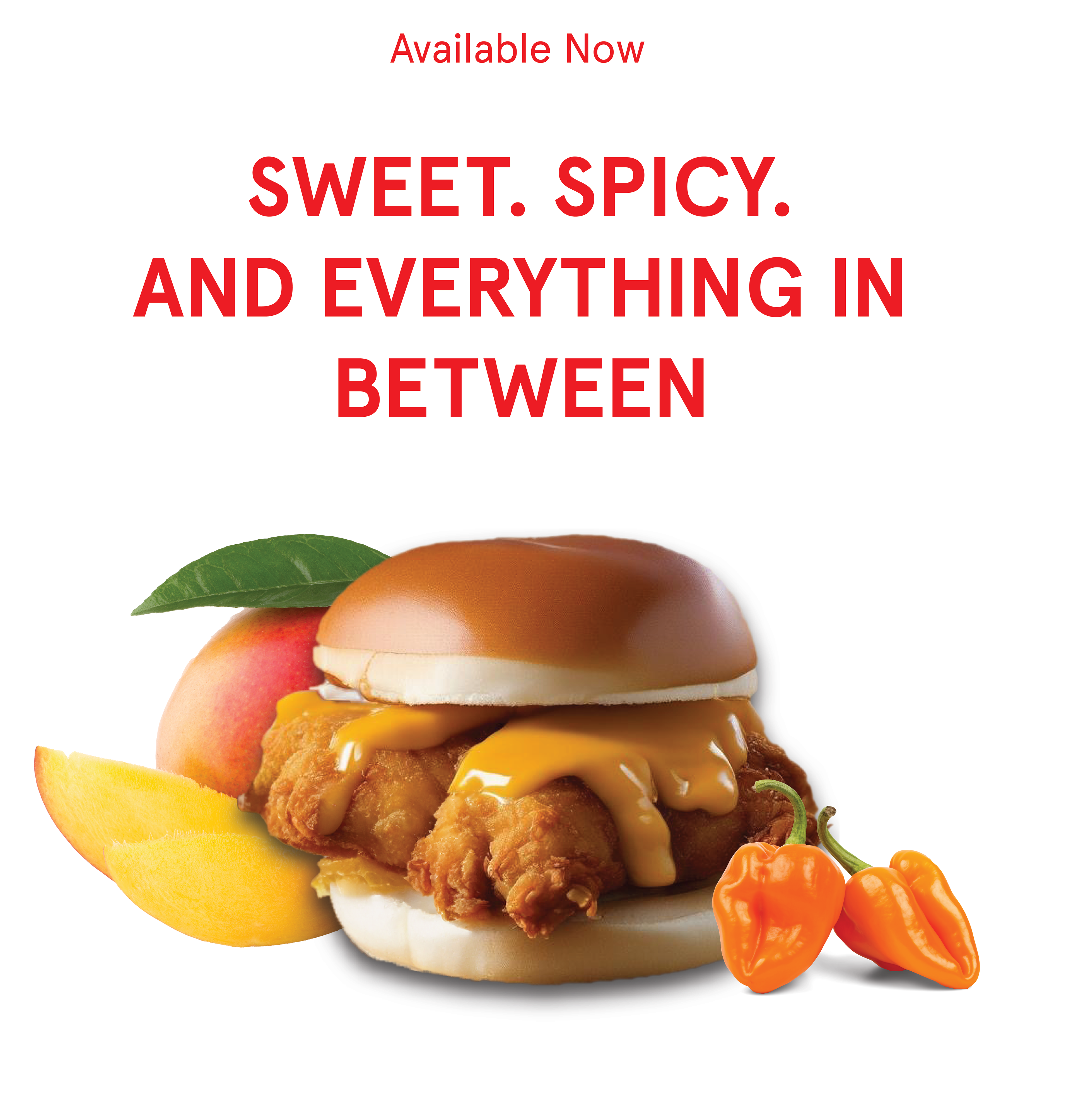
I conceptualized the Mango Habanero Sandwich, designed to offer the perfect balance of sweet heat. I treated this as a full-scale campaign by conducting research on Chick-fil-A’s brand, customer preferences, and market trends in the fast-food industry. The sandwich features a crispy chicken filet glazed in a mango habanero sauce, paired with fresh toppings that complement the brand’s high-quality ingredients.
Approaching this as a client project, I explored various concepts, sketched initial ideas, and refined them into detailed mock-ups. I showcased my comps, discarded ideas, and behind-the-scenes sketches to illustrate my design thinking and problem-solving skills. The final concept is presented as a full package, complete with branding assets, in-context mock-ups, and a proposed launch campaign.
This project demonstrates my ability to think strategically and creatively, offering a complete branding solution from concept to execution. It highlights my skills in research, design, and presentation, underscoring my readiness to handle client-driven projects in a professional setting.
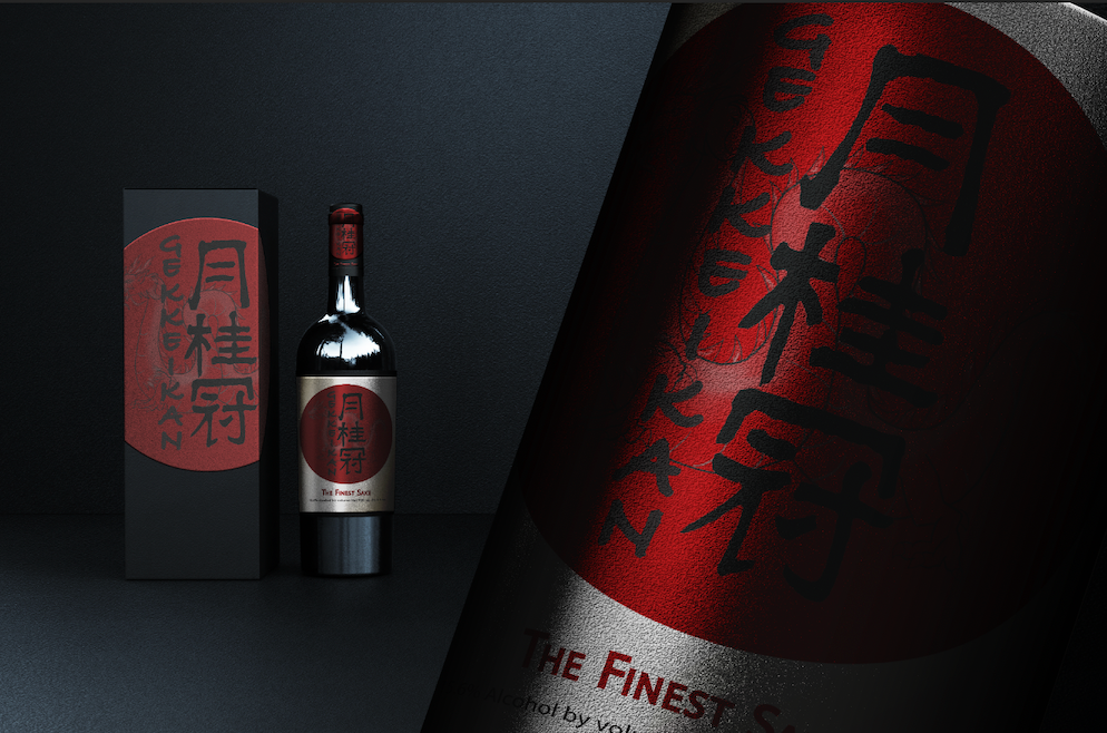
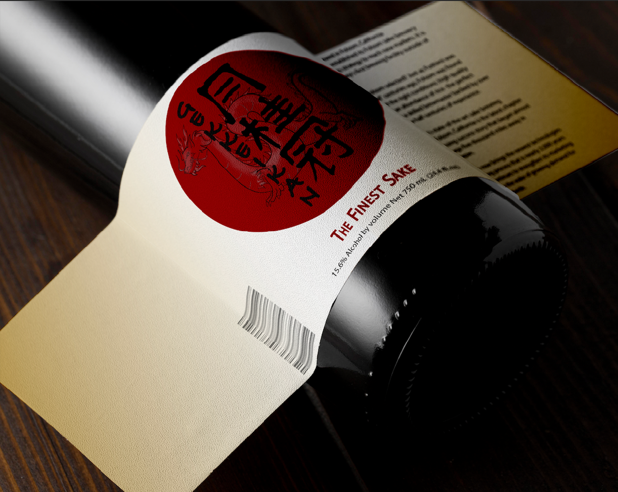
The Finest Sake- Rebrand (College Work)
This project involved conceptualizing a traditional sake company's rebranding to bridge the gap between heritage and modernity. The design reflects a balance of tradition through Japanese calligraphy and bold, contemporary packaging elements.
Key Features:
Logo & Label Design: A minimal yet striking circular logo, incorporating Japanese characters and a refined red-and-black color palette to evoke elegance and tradition.
Bottle Design: Modern, premium bottle aesthetics designed to appeal to both traditionalists and modern consumers.
Custom Typography: Hand-drawn Japanese script integrated with clean, legible type for international audiences.
Packaging: The high-end box design, with subtle textures and gold accents, enhances the brand's luxurious feel.
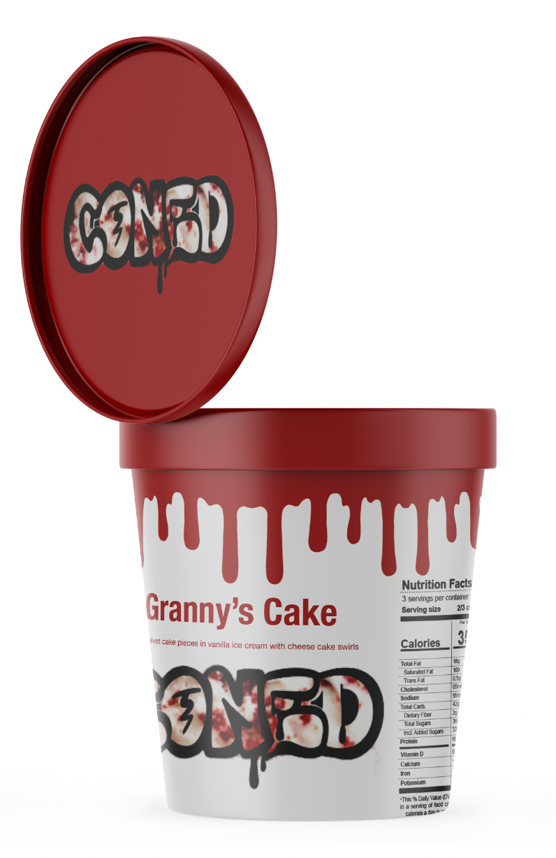

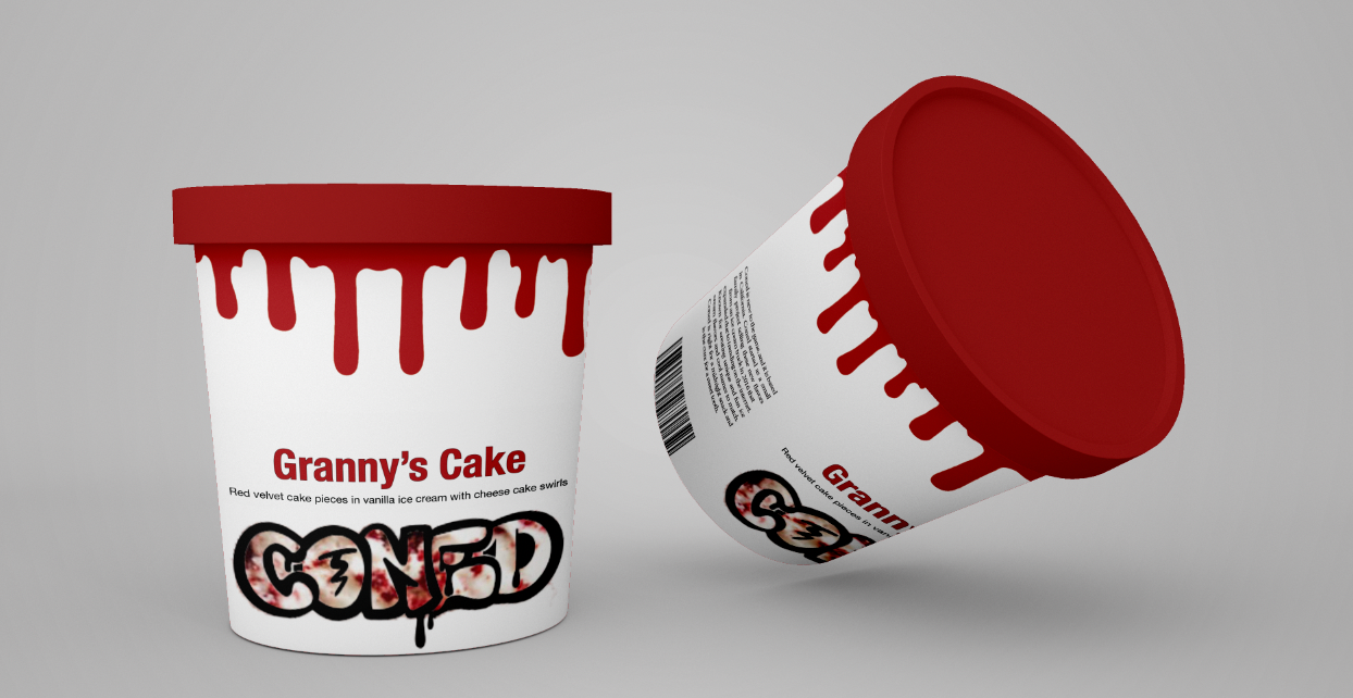
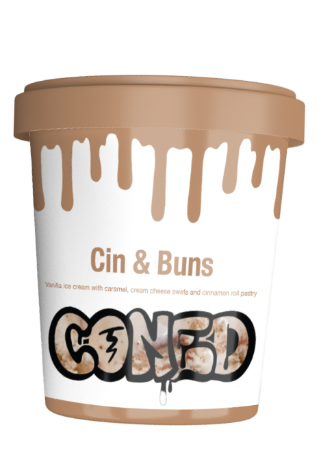

Coned Ice Cream Brand Concept (College Work)
For this project, I developed Coned, a playful and trendy ice cream brand focused on bold, humorous flavor names and vibrant packaging. The concept was designed to appeal to a younger, fun-loving audience, blending unique flavors with eye-catching visual elements. Each ice cream flavor comes with a quirky, memorable name like Hot Girl Fundae, Granny's Cake, and Cin and Buns, adding personality to the brand and making it stand out on the shelf.
Key Features:
Brand Identity: A bright, modern logo paired with a lively, fun color palette that reflects the playful nature of the brand.
Flavor Names: Each flavor was named with a humorous twist to engage customers, such as Hot Girl Fudge for a rich chocolate flavor or Cinn and Buns for a cinnamon roll-inspired treat.
Packaging Design: Bold, minimalistic labels with playful typography and fun illustrations to make the products stand out. Packaging design reflects the whimsical tone of the brand while maintaining a high-quality, professional appearance.
Brand Voice: Designed to feel approachable and engaging, with a focus on humor and relatability to make the brand more memorable and fun for customers.